The way that different hues can influence human behavior and perception, particularly in marketing and branding, is known as color psychology. Regarding custom box design, the strategic use of color can attract consumer attention and communicate your brand’s core values, evoking the desired emotional response.
To give your product a competitive edge, you should take some time to uncover the essentials of color psychology and learn quick tips to utilize this powerful tool effectively in your custom box designs.
What Color Psychology and How Can You Use It?
As mentioned, color psychology is the science of how color affects human behavior and mood. Certain colors tend to evoke specific psychological responses across different cultures and personal preferences.
When selecting colors for your custom box design, it’s essential to consider the aesthetic appeal and the subconscious messages you are sending. Combining color theory with a solid understanding of your target audience can dramatically enhance your branding strategy.
However, remember that what you’re selling should also affect your color choice. For example, you wouldn’t use the same color psychology for food as you would for other products, even if you’re trying to convey a brand message. Even if your brand focuses on organic and sustainable ingredients, you wouldn’t use earth tones to package spicy flavors. In these instances, you may want to use an array of colors or rely on your brand’s logo.
Let’s take a look at the impact of primary colors to get a better sense of how this works.
Red: Urgency or Passion
Red is often considered the most emotionally intense color, conveying passionate love or urgent warning. It’s a bold choice for custom box design, capable of making your product stand out on a crowded shelf.
Red is known for stimulating the appetite, as it can increase heart rate, blood pressure, and, therefore, metabolism, making it an excellent selection for food packaging. However, too much red can be overwhelming or perceived as aggressive. For a subtler approach, consider pairing red with neutral colors to temper its intensity while leveraging its attention-grabbing potential.
Blue: Trust and Reliability
Blue, often associated with the expanse of both sea and sky, embodies a sense of calmness and serenity that appeals to our longing for tranquility and order. In custom box design, blue can communicate reliability and high quality, reassuring customers of the product’s credibility. Lighter blues can soothe and welcome, perfect for packaging health and wellness products, while deeper blues signify wisdom and strength, making blue a suitable hue for technology or automotive products.
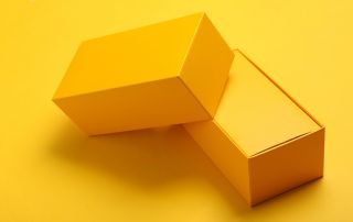
Yellow: Warmth and Optimism
Yellow’s association with the sun’s rays casts a glow of optimism and evokes a sense of welcoming friendliness—ideal for brands aiming to present a joyful, young-at-heart image. However, choosing the right shade of yellow is crucial. A vibrant, sunny yellow can inject a burst of energy and creativity, while a softer, pastel hue might offer a more comforting and gentle appeal. The key is to use yellow to forge an immediate emotional connection with potential customers, inviting them into the experience you have crafted just for them.
Hopefully, these color psychology tips give you the confidence you need to design a stellar custom product box that stands out in a sea of other products.
The good news is that no matter what color combo you choose, Tigerpress can bring your design ideas to life. We offer a wide range of custom paperboard boxes that we can tailor to meet your brand’s specific needs.